
User Journey Analysis: Lessons from Miro Onboarding
User Journey Analysis: Lessons from Miro Onboarding

👋 Hi, I’m Harkirat Singh. I write Inside Startup, a newsletter to help Startup founders and Product growth managers to accelerate their product growth through GTM strategy, growth and marketing experiments.
📥 Don’t miss out on interesting product & growth teardowns in your inbox every Monday and Friday - just enter your email here to sign up:
Happy Holidays!
Merry Christmas!
I hope your Christmas is filled with love, laughter and lots of family time 🤩.
I am back with another Product Teardown 💪
This time, It’s a B2B SaaS product — Miro.
During the pandemic, most businesses all over the world didn’t have any idea how they can take up manual creative brainstorming and complex project planning online.
My company was also in the same boat.
But, fortunately, we discovered Miro at that point of time.
Miro is an online collaborative whiteboard that lets remote and distributed teams do anything from brainstorming to project planning.
Even, we also managed to pull off a couple of our projects using Miro :D
In this post, Let's have a closer look at Miro’s onboarding and activation experience from the lenses of a new user + a PM.
1. Landing page
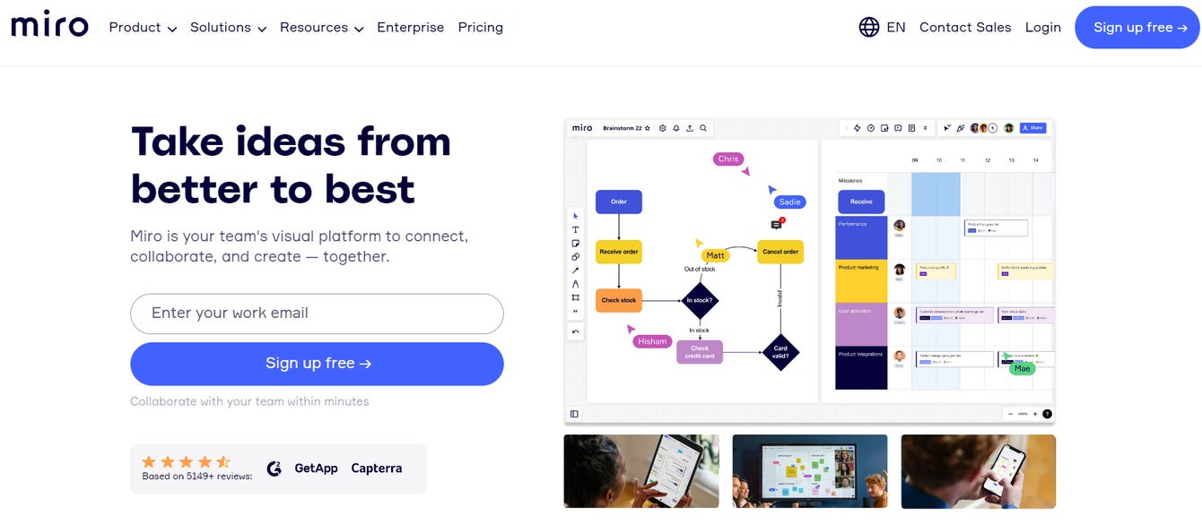
The Headline clearly talks about the “Outcome” user will get with Miro. In addition, the sub-headline defines the USP of the product.
The Images on the right side complement the copy and gives a sneak peek into what the users can achieve with Miro.
Adding social proof ratings from platforms like Capterra is essential to build trust with a user.
Because reviews and ratings on these platforms are carefully monitored, and Users know they can trust their information.

As the user scrolls down, the user will observe the impressive list of clientele (such as Walmart, Cisco etc), that have a massive team & are market leaders in industries that frequently requires brainstorming + collaboration.
Improvement/Experiment Suggestion 1: Too many links on the navigation menu might distract the user to leave the onboarding flow and jump to another page. Removing irrelevant Navigation links might help Miro increase “sign up” conversions.
Improvement/ Experiment Suggestion 2: Miro can show its product in action by replacing Static Product images with a GIF. This might help users visualize how easy it is to use Miro for brainstorming and collaboration. This further might increase free signup conversions.
2. Signup screen
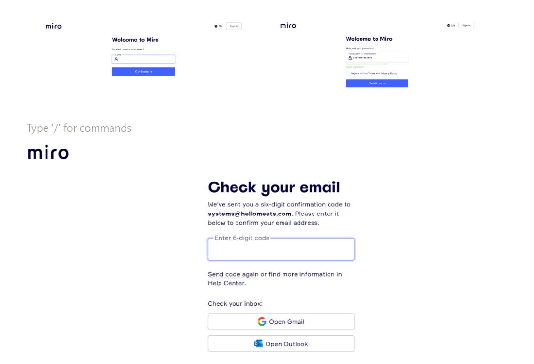
Moving ahead, the User tries signing up for the Free version, and the platform asks for his name and password.
Initially, it asks users for only Email but the fields increased once the users move to the next step. This is known as Progressive disclosure.
Progressive Disclosure: Progressive disclosure sequences information and actions across several screens (e.g., a step-by-step signup flow). The purpose is to lower the chances that users will feel overwhelmed by what they encounter.
The idea is to reveal/ask for only the relevant and important info and then move on to disclose complex and less frequently used options and information.
This helps to maintain the focus and attention of users by reducing clutter, confusion, and cognitive workload.
Then, the user is been asked to confirm his email even before the user has experienced the core value proportions. Instead, Miro can experiment with Deferred onboarding.
Improvement/Experiment Suggestion 3: Miro can let users explore the platform and experience its real value before prompting them to confirm their email.
This might help Miro significantly lower the entry barrier, increasing the number of visitors and, eventually, signed-up users.
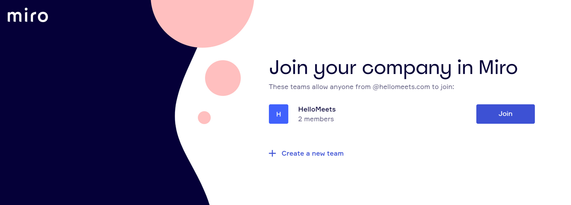
After the Email confirmation, the user has been asked to join their company workspace already on Miro.
I am in love with this screen. Why?
Miro clearly understands the primary user's goals i.e real-time collaboration with its team on certain projects.
In addition, this saves users the extra step of creating a new team, designing a new board etc. and enables them to experience the product's core proposition quickly.
3. Setting up a new team
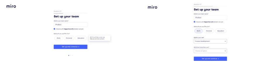
Let’s assume the user decided to create a new team.
Again, The user is bombarded with another form.😬
But the Miro team interestingly used Progressive disclosure decreasing the chances users will feel overwhelmed by what they encounter.
In these 7 question forms, Miro also tries to customise the user journey by understanding the User’s profile. Screenshots below:
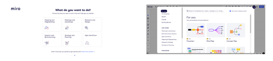
Miro has multiple user segments with different goals.
So, it’s better to understand “what job the user is hiring your app for” (JTBD) by customising the journey within the product.
Jobs-to-be-done (JTBD): JTBD describes, with precision, what a group of people are trying to achieve or accomplish in a given situation.
A job-to-be-done could be a task that people are trying to accomplish, a goal or objective they are trying to achieve, a problem they are trying to resolve, something they are trying to avoid, or anything else they are trying to accomplish.
Miro did the same by promoting self-segments by choosing their use case and motivation behind using the Product.
A user may doubt the app's intent behind asking for such information before they experience the core value.
For such a situation, Miro gives a brief reason behind the customization to build confidence.
Remember: A great onboarding experience is one that proves to new users that your product will help them do the job that they want. This increases their chances to reach an aha moment.
In Addition, Miro let the user start from scratch giving decision-making power to the user.
The user is then asked to choose a template.
By showing the user “For You: personalized Recommendation” , The user feels excited and confident to take the core action that he intended to without much friction.
It’s the Framing effect in play.
The Framing Effect: The framing effect happens when your decision is influenced more by how the information is presented (or worded) than by the information itself.
The Product shows templates the user is already familiar with (e.g: mind map, flowchart etc.)
This made it easier for the user to get started with the product quickly.
4. Start using the product
Finally, the user can see the intended board in action instead of a blank slate.
This means the previous user inputs during the sign-up stage were saved to craft this customized board.
Next, the Product tries to reduce the learning curve for the user by using nudges.
By creating a series of nudges to provide a tutorial-like flow...users are able to follow the most optimal path to build their first miro board.
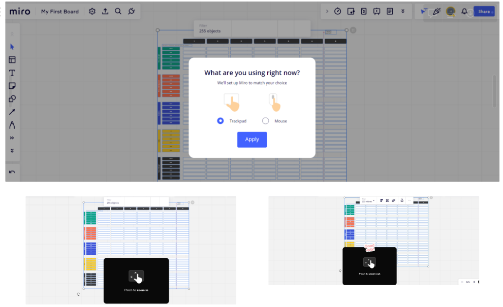
The moment the user performs certain simple actions on Miro (e.g: Pinch to zoom out) the Product celebrates by acknowledging it with a Visual element (e.g Good Job), as shown.
That creates a positive emotional connection between the user and the Product.
It ensures that users keep using the Miro.
Positive Reinforcement: When new users have a positive experience during first-time usage, it increases the chances of coming back on the platform again.
That’s all from Miro!
If you like what you read, please share this post within your company Slack or Whatsapp groups. It means a lot to me :)