
OtherShip🧘🏻♂️Onboarding Teardown: Quick Insights to Replicate in Your Product
OtherShip🧘🏻♂️Onboarding Teardown: Quick Insights to Replicate in Your Product

👋 Hi, I’m Harkirat Singh. I write Inside Startup, a newsletter to help Startup founders and Product growth managers to accelerate their product growth through GTM strategy, Growth and marketing experiments.
📥 Don’t miss out on interesting product & growth teardowns in your inbox every Monday- just enter your email here to sign up:
I’m bullish on guided meditation.
But my meditation habits took a hit over time because of less time and long working hours. Bad work-life balance exposed me to well-being issues, such as stress and frequent mood shifts.
To improve this mental imbalance I thought of getting back to my Mediation routine by starting with some basic breathing exercises.
I already tried Calm and headspace for breathing exercises but found them a bit boring.
So I visited Playstore to find a breathing exercise app and hopped on to Othership.
Othership is a music-driven breathwork app designed to explore our emotions in a fun way.
The music chosen in Othership sessions is based on criteria to affect your mood according to your needs.
Moreover, the tempo of the songs is arranged in ways that help you keep track of your breathing very easily.
In this post, I’d be covering the onboarding Teardown analysis of the Othership App through the lens of a Product Manager 👓.
Othership Onboarding Analysis
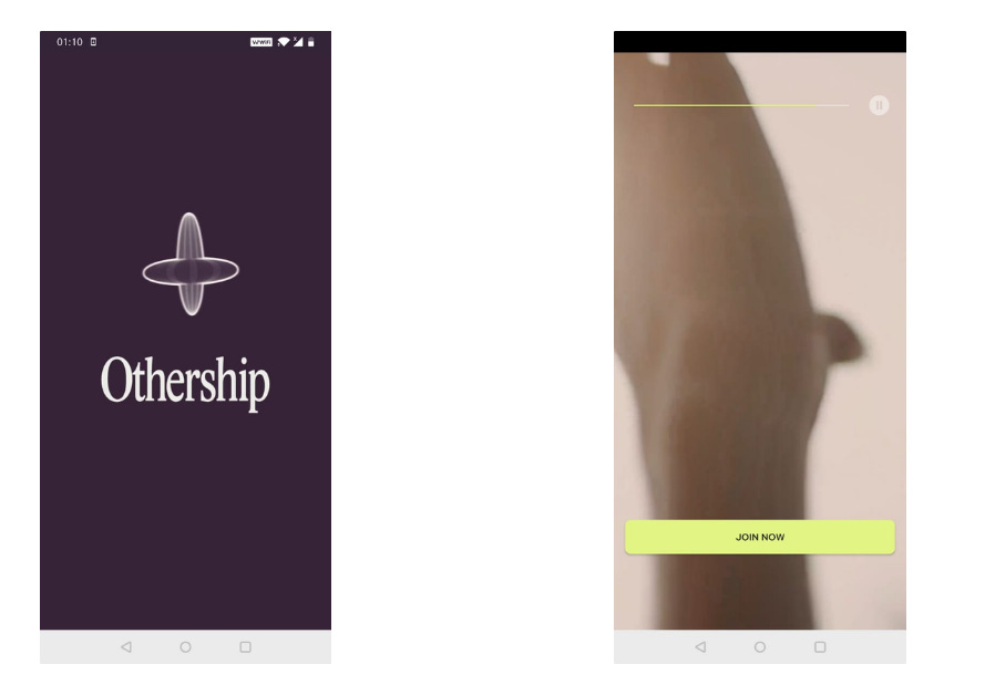
Once I opened the app, the initial screen asked me to Join in with a video playing in the background.
This 10-15 seconds engaging Video shows the product in action and its impact on the ideal user.
💡I think it was a smart decision since it’s much easier to follow along with a video than a list of detailed steps (that most of us often “skip”).
💡Moreover, The button copy could be improved from “Join Now” to “Start your Breathwork journey” (action-driven) or “Experience peak Emotional well-being” (Outcome driven).
The copy is the last thing your new user will read before clicking (or deciding against clicking), so the precise language you choose can make or break the user’s curiosity.
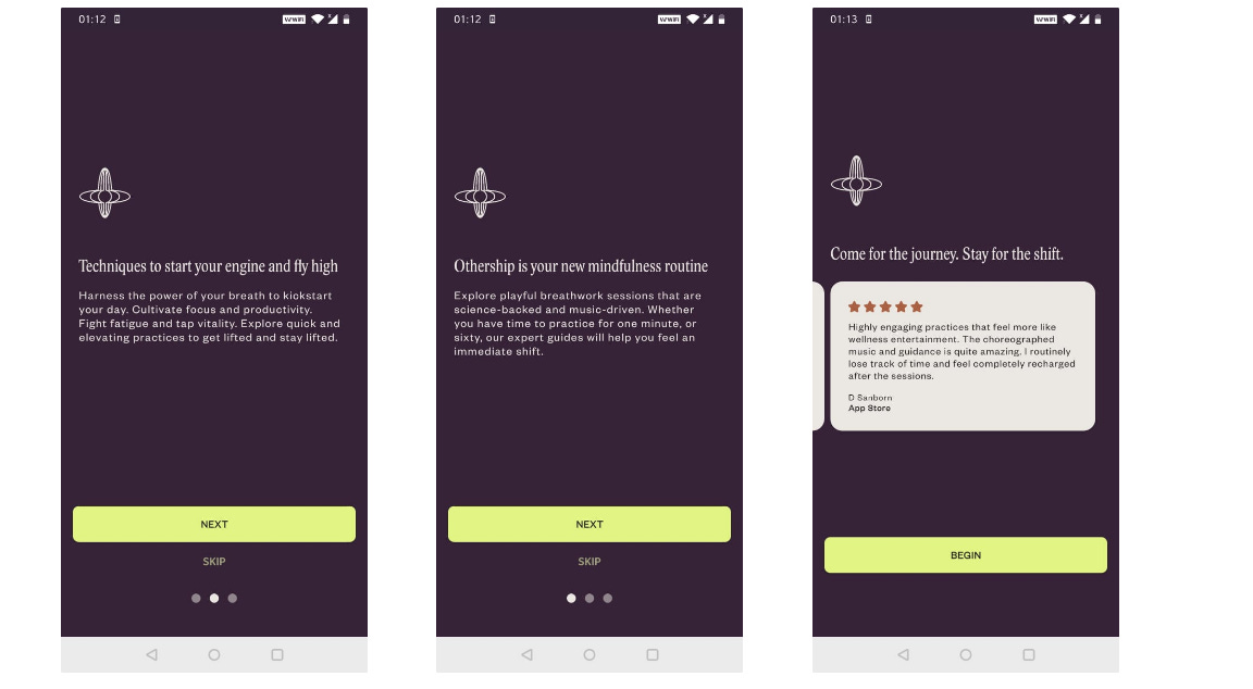
Once I clicked the “Join Now” button, I hopped onto the Deck of Carousels showcasing the Benefits of the product.
This surprised me since I already watched the Product showcase video on the previous screen.
💡Onboarding flows require user attention and effort. And this product could have communicated the Benefits in the text by showing it on the video itself.
One good thing they did here is to give users the choice to skip this flow if they want.
💡 Instead of just showcasing just the Product Benefits, they could have also explained Product jargon like “Up”, Down” etc. (More on this later).
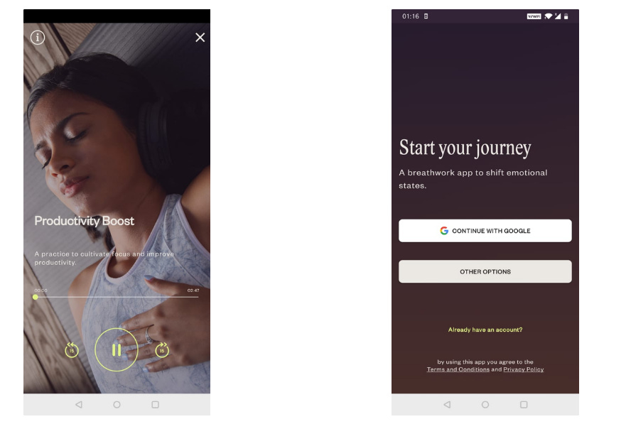
Moving on from the benefit Carousel, I finally experienced the core value of the product.
The Product takes you to the screen where you can experience a Productivity Boost meditation session.
💡Including this 2-min session ensures that the user is activated quickly as possible.
However, not every user would be hiring Othership for boosting Productivity. Some might be here to distress themselves with soothing meditation and others for improving their sleep cycles.
💡The Product can include a short form to get the users’ intent behind using the app and hence personalize the rest of the journey.
💡After completing my first meditation the product asked me to sign in. Letting the user experience the product first and then asking to sign-in builds is a smart move to increase users’ trust.
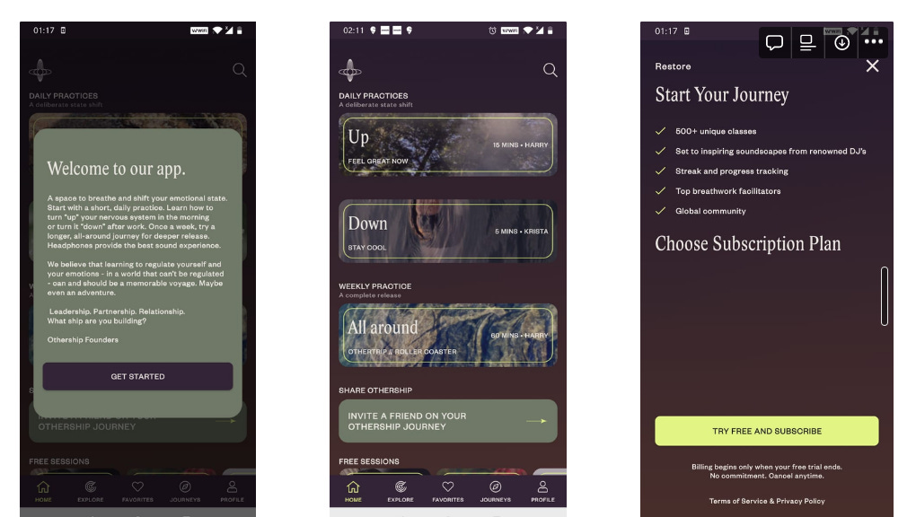
After landing on the home screen I saw a Popup with a message from the founders.
The message communicates the Key product features like ‘Up’ and ‘Down’ which should’ve been covered during the Onboarding carousels.
I was excited to try these features. But the moment I clicked the ‘Up’ Card it asked me to subscribe.
A similar experience happened when I clicked ‘Down’, ‘All Around’ cards.
Honestly, I was about to drop off since I thought there were no Free Sessions for me to explore until I scrolled and hopped onto the ‘Free Session’ Section.
💡The Product could’ve placed the Free Section at the top for users to start using the application.
💡Plus, The Paid sections should have a Premium icon to communicate the paid features clearly to the users.
That’s all from this post!
If you like what you read, please share this post within your company Slack or Whatsapp groups. It means a lot to me :)